Two well-established painters and longtime friends, Elena Sisto and Stephen Westfall discuss painting and the qualities of abstraction as they focus on a recent Westfall survey titled Ornithology, at Alexandre Gallery in New York City, including a site-specific hallway mural that remains on view through 2026. In their intimate conversation, they touch upon many other aspects of art, of life, and painting SPACE.
ELENA SISTO: In our conversations about painting, you sometimes refer to yourself as a “painter of edges, not lines.” What does that mean?
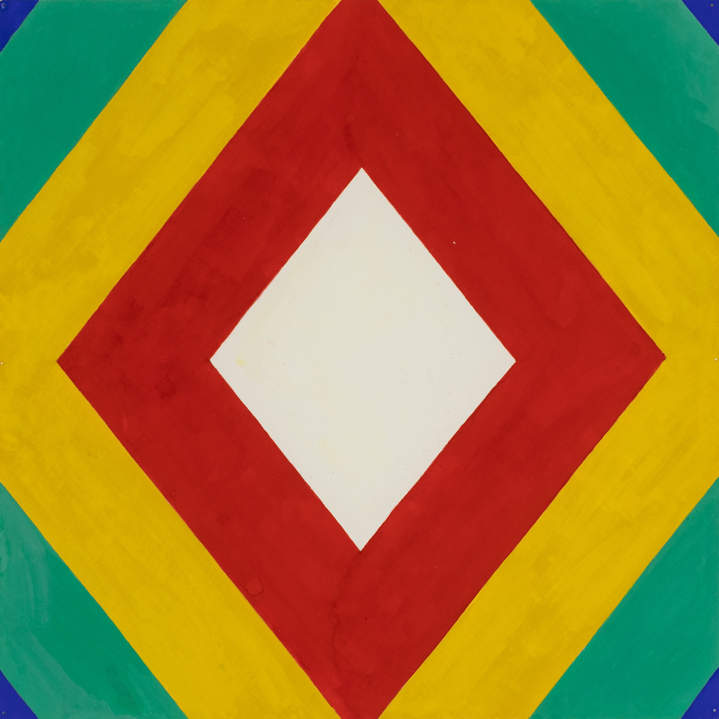
STEPHEN WESTFALL: I mean I don't paint lines in short bursts of shading or calligraphic ribbons like some painters I admire, such as Patricia Treib. Instead, I fill out shapes with a volume of color using a sable flat brush to get an even plane of color. All the planes are laid over one another, and it takes several coats and spot wipe-downs to get the edges really flush. Of course, the edges are imperfect, and I find grief and comedy in that inevitability. All of that would be lost if I used tape. There's really no place for a line to exist on the surfaces of my work. But, in the end, edges are lines, so there's a kind of return to the function and performance of lines in my paintings—even without them.
ES: How many coats are we talking about? Do you mix colors physically (red plus green) or optically (red over green) or both?
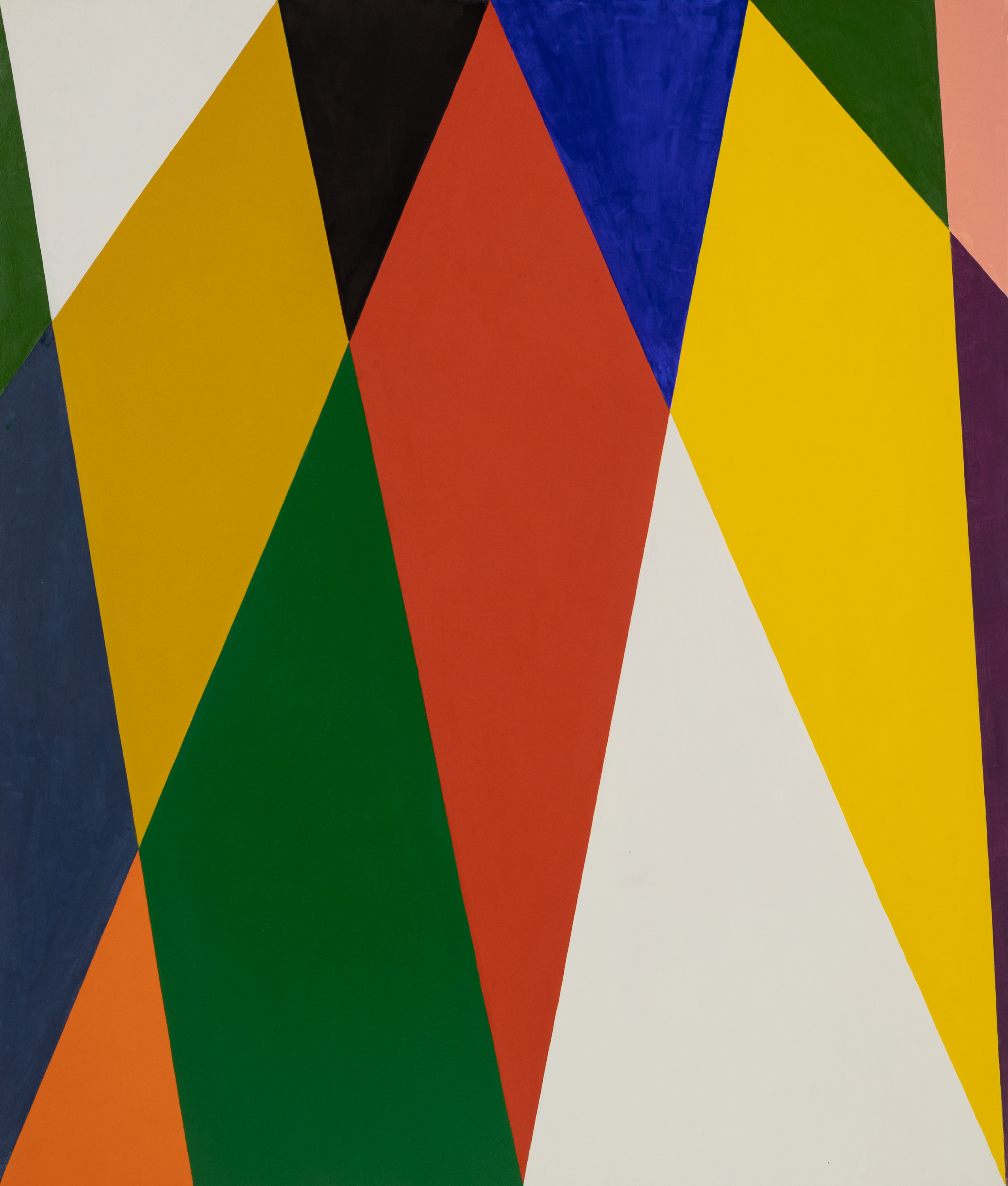
SW: I would love to finish each color in less than five layers, but it always seems to take seven or eight, sometimes more if I'm changing a color or altering the boundary of a shape as I did with the green trapezoidal diamond on the lower left of my painting Kingdom Hall from 2025. Since I'm usually painting on a light ground, the first layers are somewhat transparent. Certain colors, of course, are more transparent than others, such as blues, most greens and the range of colors called lakes. Cadmium red seems to be just about the most opaque, but even then, I need a number of additional coats to get to the flatness with depth that I'm after. The body of the paint is fairly thin, extended with mineral spirits, oil, and a bit of alkyd to even out the drying. The initial transparencies are a byproduct of this thinness. I think of the process as meditative, otherwise it would be exasperating. My playlists help.
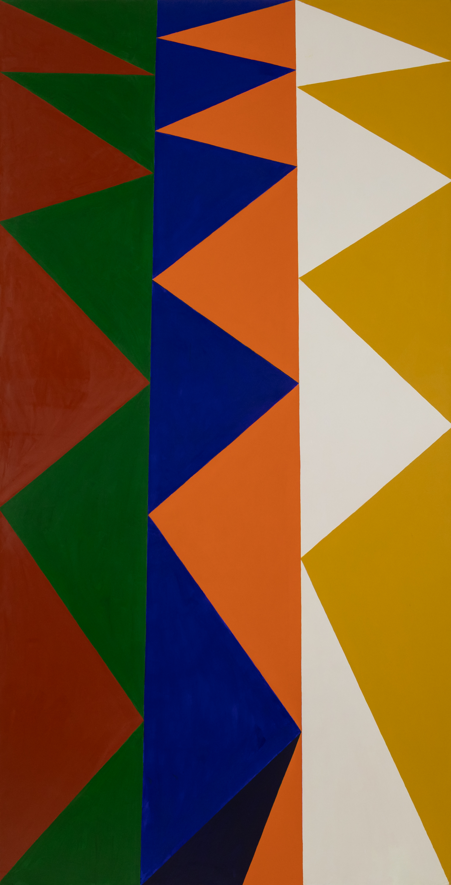
Almost all my color is mixed before it goes on. There has only been one recent instance of a color created by painting one color over another, or ton sur ton——a reference to Bonnard. This anomaly occurred at the bottom center of Jitterbug Waltz [2024], when I accidentally slipped a brush of ultramarine blue across the bordering orange field (remember, these colors are already cross-mixed with a homeopathic dose of their complement). It created for me such a shockingly rich black that I chose to build another plane around, so that it becomes a nearly volumetric shadow-plane at the foot of the serrated blue shape.
ES: Do you often follow an accident that way in your work or is it mostly planned ahead? And would you explain “flatness with depth”?
SW: I almost never have such productive accidents because I tend to see a painting as a whole before I engage the materials, and I'm painting over a prepared drawing on the support. I'm certainly open to them when they happen, such as the one in Jitterbug Waltz, but that was a slip of the brush, which rarely occurs to that extent. A Freudian slip? Maybe my unconscious wanted to offer me another color!
As to what I mean by "flatness with depth," I'm speaking of a paradoxical perception of material-based flat color as being concretely present and infinitely recessive: you could look into that red, or blue forever. It's the paradox of infinity, really, in that it is as close to us as it is distant. A stand-in for eternity, or the divine, if you will, which is why icon painters painted in flat planes. The spatial subject of icons is a world saturated with divine presence. They are recreated in painting by color that needs to be built-up into flatness, since the first coats are going to be transparently revealing brushstrokes. Another paradox: only in flatness can the materiality of the color disappear, but that flatness is created by material addition.
ES: Going back to lines, they tend to separate forms which can diminish the lateral movement of color and value. I never saw the suggestion of movement sideways or on a diagonal in your work this much before. And the colors so strongly respond to each other across the plane. There's a familial correspondence going on, lots of new types of configurations coming forward and then being overtaken by other configurations. Very conversational and chaotic in a sort of gentle way.
SW: And yet these paintings are mostly vertical, some decidedly so (okay, three squares), which means that the sideways movement you allude to doesn't have a lot of sideways room to play out, so the paintings wind up vibrating like a struck bell. At least, I hope something like that occurs. The colors are all cross-mixed, despite their higher keyed appearance, so they do wind up sharing a common light. "Space," here may be made to be more specific as a term since the paintings tout their flatness as a base condition. And I think a lot of the movement derives from the interlocking of diamonds (in a painting such as Kingdom Hall) and triangles in so many of the others. These are simple geometric forms that eschew horizontals and verticals in favor of diagonals which break away from alignment with the exterior borders of the rectangular canvases, thus movement. Some "looking into" pictorial space occurs where a darker color recedes, especially where boundaries of shapes overlap, as in the Cabana paintings, but it's a shallow recession that is quickly brought back to the surface. There's definitely some internal jostling. But I thought we wanted to talk about space. . .
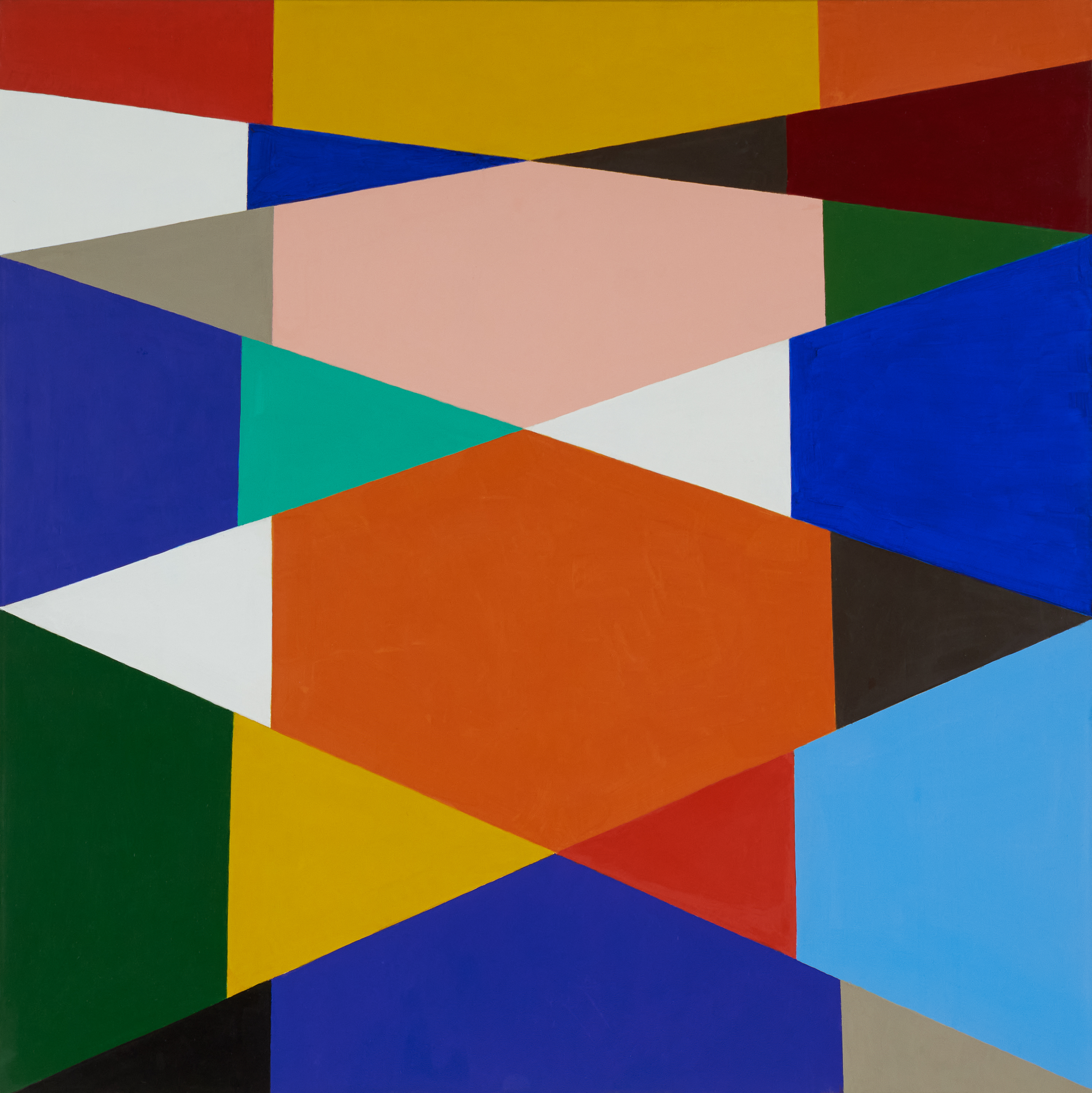
ES: Some of the paintings are not only vertical but have stacked forms running up a central axis like a spinal column. But about the space, I was distinguishing between moving in/out, which you have done for a long time, as opposed to across the surface up/down/left/right. Your paintings have long had a highly compressed space, but two things seem new: loosening your allegiance to the grid and the colors have a richer and more complex, more associative quality—they are more emotional.
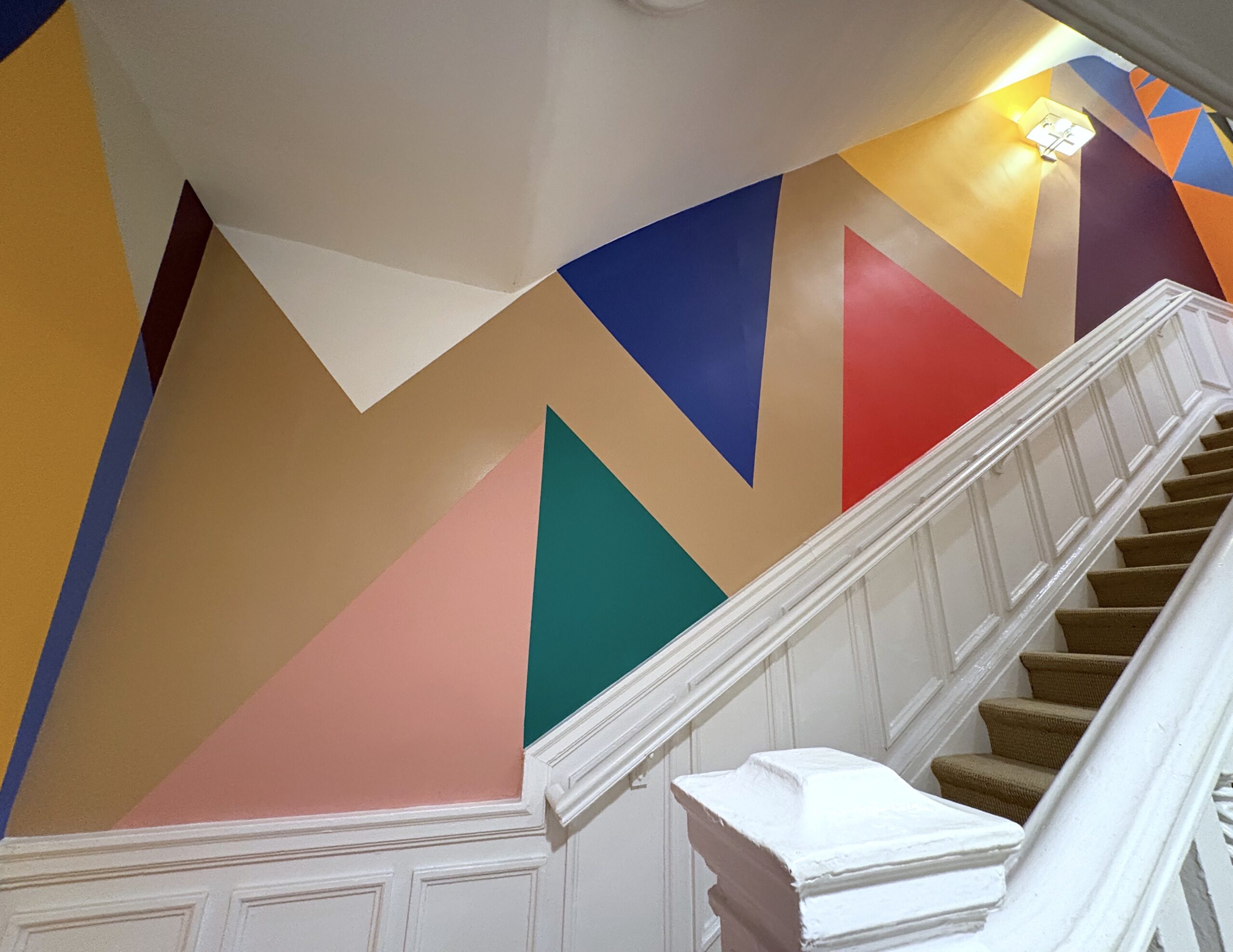
When I arrived at the show, my feet were killing me from walking all over the city. The stairs seemed so numerous and daunting but as I turned the corner, I was beckoned by a group of huge friendly diamond shapes and triangles loitering at the end of the hall that stood to attention and kindly directed me to the next flight of stairs. A long, light, ascending, stepped form much larger in scale than the real steps lifted me up and slowed me down into a different mental space. At the next landing a cluster of smaller forms in the corner introduced a spark of Matisse and his Jazz cutouts. Then, another group of cordial medium sized forms accordioned open to usher me into the exhibition. This kind of sequential orchestration is new for you. How has considering the public viewing of your mural influenced your thinking about the space of the pictures?
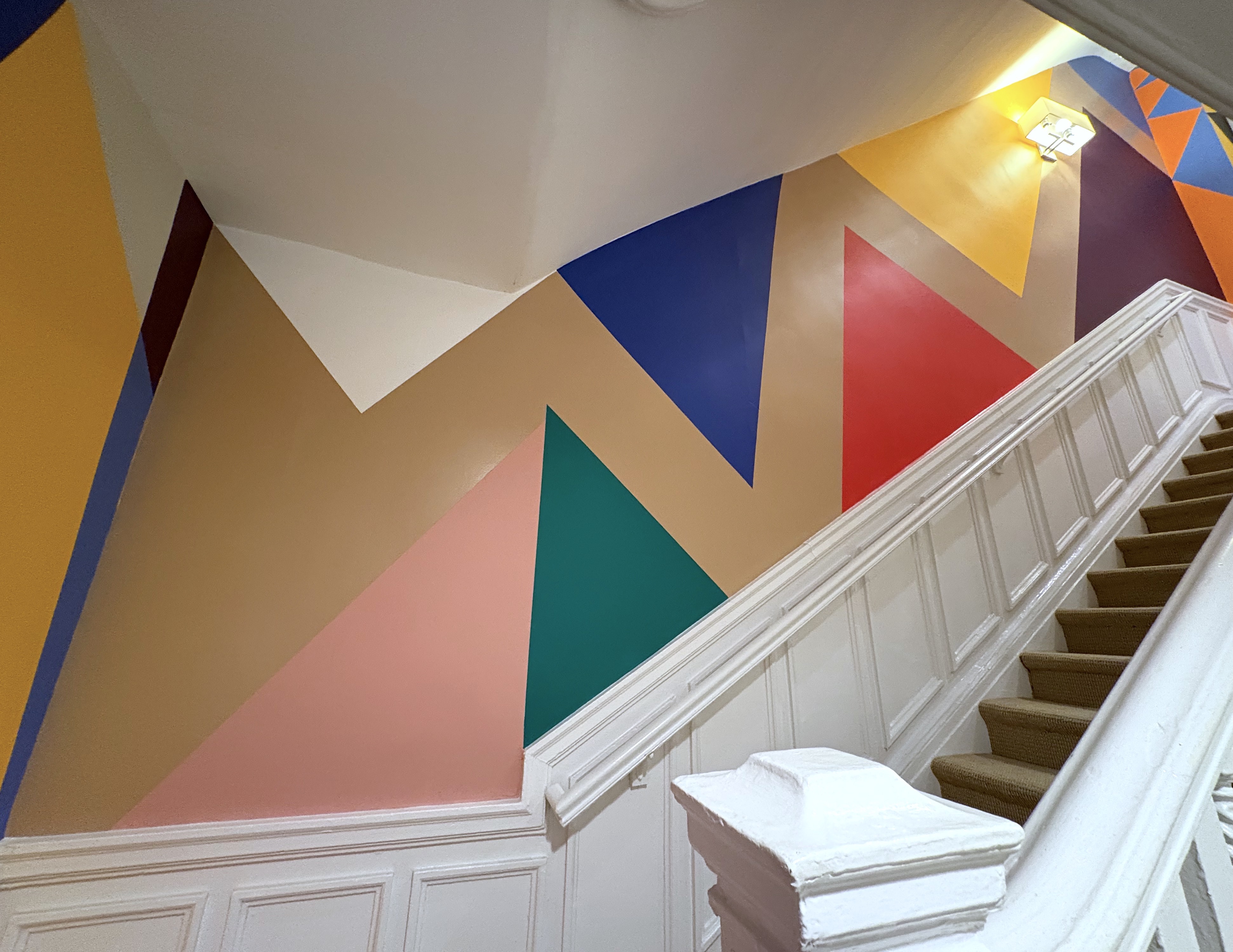
SW: That's a lovely narrative of how the stairwell wall paintings unfold as they ascend. The way the show opens through the third-floor doorway echoes the second-floor wall painting, Kingdom Hall. The painting on canvas is a more compacted vertical rectangle, and the colors are different, a little more verdant, but it establishes a rhyme between the upswinging arcs in the fanning of the elongated diamonds.
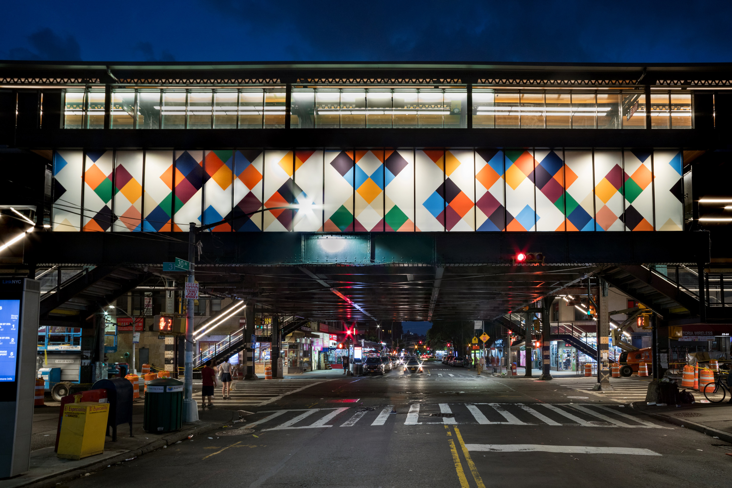
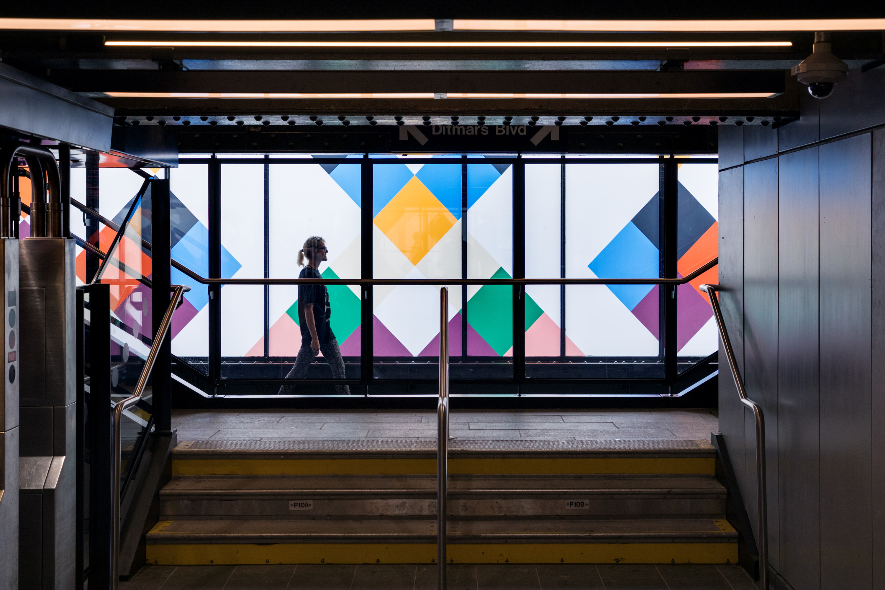
As for a general statement about my public murals, one could trace their development from 2007 until now and note that they coincide with my introduction of diagonals into painting compositions that began in the early aughts with rows of pennant flags. The arrays of pennant flags, chevrons, and diamonds that run from the first wall paintings in 2007 at Solvent Space in Richmond, Virginia, through my 2018 glass panels for the Astoria N/W subway station can all be said to still align their compositions with the evenness of a grid. I figure out ways to have unpredictable leaps of color and conjoined shapes as I move toward the subway panels, but there's still an even, locatable grid underneath everything.
When I did my first wall painting for Alexandre Gallery at their Grand Street space in 2021, I completely embarked from the grid's safe harbor by throwing triangles and an elongated diagonal bisection across the walls like confetti. I really wanted to upend my former relied-upon orientations. The most recent stairwell painting is a little more disciplined, I think, and really integrated into the form and proportions of the space. It performs as you say, and there's not an even grid anywhere, but more of a flexing web, even a nod to gravity in the elongation of the forms toward the bottom of each image. I've been moved by and have thought about architecture long before I thought I might be a painter and the "public work", i.e. the wall paintings became a natural expression of this long-standing interest in architectural scale. Even before I've visited certain buildings and sites, such as the Salk Institute in La Jolla, I've been able to project my body scale into the spaces described by photographs.
I don't know why or how, but scale is the beginning of all my decisions about painting, and public work just emphasizes that. Abstraction is a great vehicle for disappearing into the character of a space if, and only if, the abstract language of form and color can be bent to reflect the character of the specific place. I think my subway station and this latest stairwell painting are both successful projections of a painter's formal language onto a space so that they almost sing together.
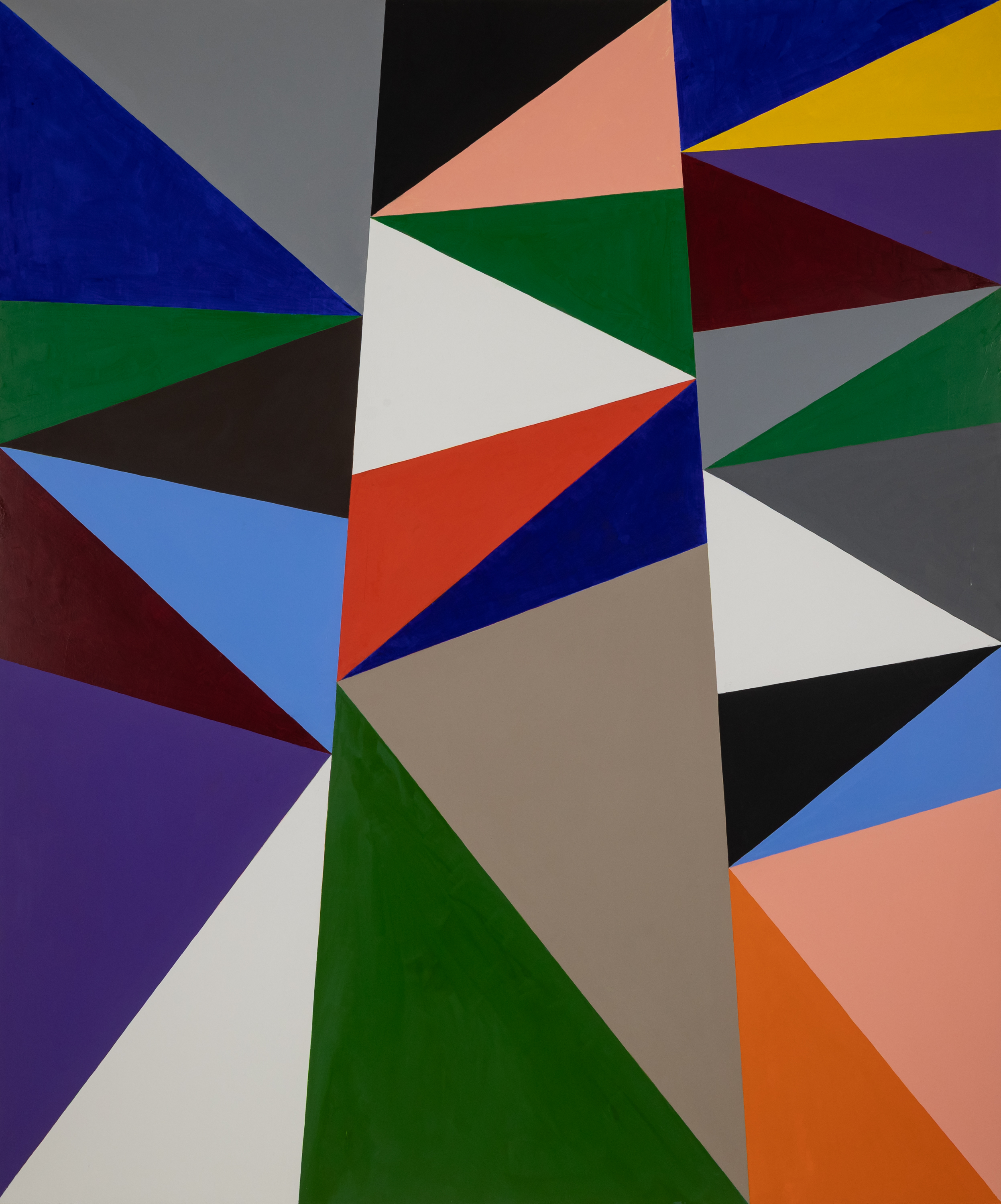
ES: The expansion of the forms at the bottom and the squeezing together at the top in Kingdom Hall made me think of a yoga teacher instructing one to breathe into the bottom of their lungs or the idea of "squash and stretch" in animation. In Kingdom Hall, a confident multicolored pyramid stretching from the two bottom corners to the middle of the top edge is planted like a parent, while two other multicolored, cropped pyramids lean in from either side, both topped with yellow diamonds like a conferring aunt and uncle. It seems like moving off the grid allows new kinds of associations to seep into the pictures that are more commonly attributed to figurative painting. Much earlier work of yours has had direct associations with billboards and window mullions, etc. This seems different, though, more internal. Are you an abstract painter who is bugged by figurative associations blurted out by your viewers?
SW: I love how you're seeing those leaning pyramids, really large ghost triangles, and allowing a figurative, even familial reading into them. I had a sudden image of the conspiring mountains around a lake that so terrified the young, joyriding boat thief in Wordsworth’s The Prelude: Book 1. Of course, they're his parents! I think Danzon and Jitterbug Waltz are more overtly figurative, with abutting triangles on the right center of each picture conjoining into shimmying an archaic-type figure form. It wasn't planned, but obviously there, as the pattern bore out. I suppose the ghost triangles could be a subliminal memory of Guston's Klansmen filtered through my love of Feininger and Popova. Distance from the immediacy of an artist's original intent and the build-up of images in the ensuing gap allow for unexpected developments.
ES: And the use of white in these pictures is quite distinctive. What are you thinking about there?
SW: For a while, the white was in every painting; less so, now. I think about it in relation to white in a Mondrian, de Kooning, Diebenkorn, and Kelly: both as a kind of aeration of the color and an indication that the painting is a sign, among other things. White is mixed down in my paintings, with a soupçon of raw umber and a mixture of red, yellow and blue. In my palette, those colors in are already mixed down a bit, though, at first, they appear to be higher keyed. I add a small amount of the complement to each color for an overall shared light. I want enough contrast so that the paintings telegraph from a distance but also want the shared light to be revealed in that middle distance and close-up inspection. I had this revelation about faded white and higher key colors sharing a common light decades ago while driving on one of many trips through Arizona on I-40. The sun just bakes those billboard colors down over time into a less jarring contrast.
ES: You've spent time in Rome. Could you talk about some of your influences there? Also, you mentioned signs (both kinds) could you talk about that too?
SW: [laughter] That's like three questions in one! I'm going to try to scroll backward. Signs, images that hold such a number of associations that they compress into symbols, have always been in painting. I'm especially enchanted by paintings that show they are signs for painting without making too big of a deal about it, remaining beautiful without too much semiotic clutter. Lichtenstein does this. So do the Pompeiian wall paintings at the Met that frame a single color as a view. There's a whole lot in between, including those marvelous voids: the black doors that appear in Giotto and Fra Angelico, which transform into the cubic lantern in Goya's Third of May, and reappears in darkness in the mouths of Courbet's caves and mines, leading ultimately to the monochrome squares and full canvases of the twentieth century. They aren't tautologies pointing to the end of painting, but point instead to what painting can do, prophesies of what painting can bring forth and incarnate, even amid political inversion and despair. When I was in Rome I was studying Cosmatesque tesserae floors in the churches, this supple Byzantine geometric ornamentation made from spolia, fragments of white, red and green marble from ruined Roman architecture. They are a lesson in reconstitution and transformation. And how rows of straight-edged triangles can snake into curves. Of course, Rome is full of paintings and frescoes. I found it to be a tremendous consolation. I saw both de Chirico and Guston in Rome. Guston came to his renewed pictorial language there, at the Academy. And there was a great Calder show. Rome is a great place to be an artist if you're not concerned with showing or selling [laughter]. But the Academy asked me to do a show in their gallery and with the help of one of the architecture fellows, Kiel Moe, and some wonderful art students from Tyler and Kenyon, I managed to take another leap with the wall paintings.
I think that since you and I have talked so much about painting space that you might interject some observations of your own on your work and/vs mine, then invite me to respond.
ES: What I mentioned earlier about color is about space. But I can say more. One of the paintings we need to talk about in those terms is the crazy wild painting Ornithology, the title of your show. It seems to be blowing apart and coming back together and blowing apart again—an apt image for our time. One almost hears voices while looking at it. Forms seem to be daring each other---to do what? There's a solid stalk of forms rising up the middle being gleefully attacked from both sides. You mention Apollo in your wall text for the show; I see Dionysus in this work. There's movement all around refusing to settle into one definitive configuration, like a beehive without a queen.
Your spatial subject seems to be relatedness, maybe specifically familial relatedness. There's a polyphony or contrapuntal quality that’s new and I can't help but think that it's a result in part of a big change in your life--your marriage to the wonderful painter Daisy Craddock and the whole extended family you inherited in one big chunk. All the forms are talking at once. It seems like you’re seeing yourself within an extended fabric and it's resulted in a different integration of space in your work. My teacher, Nicholas Carone, used to say that the spatial structure of the picture carries the metaphor. I couldn't agree more. It’s the aspect of pictorial space I'm most interested in--how the subject is expressed by the space rather than by a narrative. Also, to be honest, when I try to talk about space, I always seem to end up talking about subject and vice versa. The main idea is that the subject comes through the form rather than form applied to subject.
SW: Love your description of that particular painting, and also your insight into the possible role that the profound changes in my personal life may be playing in shaping my aesthetic choices. I'm a big believer in that kind of connection between one realm of experience and another. I guess the Dionysian is the color dynamic and the Apollonian is the relative calm of the planar surface and the geometric order of the triangles in relation to gravity. The triangles emulate the gravitational pull on the figure as they widen and lengthen towards the bottom. It's a pull to the underworld, isn't it? That would make it Hadean!
I've long felt that "space" in painting is the subject, so I'm in agreement with Nick, there, but I want it to work like Barnett Newman's The Wild, where space is an object entering the room rather than a volume depressing behind the wall, like a window or an aquarium. Bonnard's own interiors with windows come into our space, almost all the painting I really love does. I mean, Bonnard's windows don't lead into an orthogonal mist but deposit their color right here.
I've always regarded your own painting space as "leaning in," but it's not something peculiar to you and me. It's a secret sauce that's not so secret to the cognoscenti. However, once recognized, it really changes the game. It also means that the paintings want more space around them, after all they are displacing space with their own space. There's an uncanny, atavistic recall to such painting in that we're reminded that pictorial painting begins on walls and migrates to tablets and pottery before it becomes post-icon painting in the west. When painting knowingly reverberates with its objecthood it touches something ancient, and the coexistence of ancient and Modern creates an incantatory space.
ES: Frankly, the space can lean into the wall, into the room, into the room and then back towards the wall, or into the room and then further into the room and into the wall and then further into the wall, lol. You could think of the space as a packet in front of, at or behind the wall.
You mentioned the atavistic. I want that quality--as well as Modern and contemporary elements in my work. And it does make a sound like a chime when I get it. There’s a layered and compressed experience with the ancients up to the present in terms of imagery. I want my paintings to have the tension of an icon, available to watch and interact with, but with humor and good looks! Haha, small task. There are decorative elements, but the paintings are made for use, to invite revery.
SW: The wall and the scale of the room are an essential, framing premise, aren't they? I think every painter must imagine their work hanging in rooms beyond the studio. I know I do. But I don't think of the illusionistic space within the painting as receding to even a shallow pocket behind the wall. It's inevitably "forward" for me and, in fact, I can't conceive of even a bad painting for which the opposite is true. I see your own pictorial space, even at its most populated with subjective forms, as perhaps proposing depths shuffling like a deck of cards just behind the picture plane of the painting. But that's very different from sinking behind the wall itself. For a canvas or panel painting the wall is almost a perpendicular pedestal, pushing it into the room. From a metaphysical standpoint one could say that the wall is a kind of psychic membrane that the painting passes through with a message from the other side, where all memories and absences are present, but its concreteness is before us in the here and now. It displaces what was there before it, so the previously "neutral" space of the room is reverberating all around it.
A painting can be representational and spatially descriptive while still clueing us into the artist's understanding that its first function is to appear. So few installations are sensitive to staging this potential that when it happens it feels like a miracle. The Menil Collection in Houston is one place where this happens. The Palazzo Abetellis in Palermo (designed by Carlo Scarpa, of course) can embrace such installations of Old Masters, the Kolumba in Cologne, the Kimball in Fort Worth . . . the list is short. Maybe you get a few sensitive rooms, like at the Phillips in D.C.; or the Van der Weyden, Cézanne, and Twombly in different sections of the Philadelphia Museum of Art. There are more, but not that much more. Crowds in the museums and capitalism in the galleries make it hard. But painters keep the light on in their imagination, "this painting will go here." That's why multi-media or any sound projection near a painting gallery is such an abomination. In relative silence one can almost hear and certainly feel the spatial burst of a painting.
ES: I'm interested in painting as a regenerative space, one that expresses resilience. It seems very necessary right now. Do you consider your work to be at all spiritual?
SW: I get chary around discussions of spirituality in painting, but I love the proximity of spirituality to art in the mind. Sontag says it best in the first two paragraphs of The Aesthetics of Silence, "Every era has to reinvent the project of 'spirituality' for itself." The minute I open myself to wonder, to let myself be surprised and moved, I'm participating in existence in an enhanced way. Painting is my open door to participating by asking for a response from another. ■
Stephen Westfall: Ornithology was presented at the Alexandre Gallery in NYC, 09/04/25 through 10/25/25The accompanying wall painting will remain on view through 2026.
Stephen Westfall is a painter, a contributing editor at Art in America and was a professor at the Mason Gross School of the Arts at Rutgers University. He divides his time between New York City and Clermont, NY.
Elena Sisto is a painter and art writer. She is represented by Bookstein Projects in NYC and divides her time between New York City and Milan, NY. She teaches painting at the School of Visual Arts. Her most recent essay “Assume Yes,” on the work of artist Kathy Butterly, will be published by the Tang Teaching Museum and Art Gallery in a monograph of Butterly’s work.